Luxury Color Perception Calculator
Color Upgrade Tips
Based on your color choice:
Wearing expensive clothes doesn’t make you look rich. But the right colors? That can. You’ve probably seen someone in a $200 sweater that looks like it cost $2,000-and someone else in a designer suit that looks like it came from a discount rack. It’s not the brand. It’s the color.
Dark colors create depth, and depth looks expensive
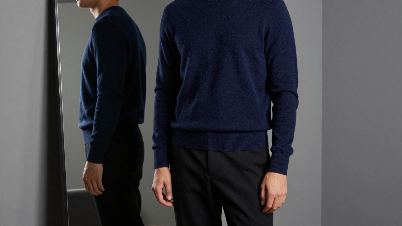
Black isn’t just slimming-it’s authoritative. Navy isn’t just professional-it’s timeless. Charcoal doesn’t just hide stains, it whispers wealth. These aren’t random choices. They’re the foundation of luxury color psychology. When you wear deep, saturated tones, your silhouette gains dimension. Light doesn’t bounce off you chaotically. It flows. That’s why tailors, stylists, and luxury brands stick to these shades. They don’t need logos. The cut and the color do the talking.
Try this: Stand in front of a mirror in a bright white shirt. Now swap it for a deep midnight blue one. Notice how the white makes your face look washed out? How the blue pulls everything together? That’s not magic. It’s contrast. Rich-looking color doesn’t scream. It holds space. It doesn’t compete with your skin tone-it enhances it. That’s why black, navy, charcoal, and deep forest green dominate high-end wardrobes. They’re not trendy. They’re permanent.
Neutrals aren’t boring-they’re calibrated
Beige isn’t just beige. There’s oat, camel, taupe, stone, and greige. Each has a different undertone. The wrong beige looks like a cheap suit from a 90s catalog. The right one looks like it was woven in Italy with cashmere threads. The difference? Temperature. Cool beige leans gray. Warm beige leans yellow. Luxury neutrals are almost always cool-toned. They sit between white and gray, never leaning too far into cream or tan.
Think of the color palette of a minimalist penthouse. Not pure white. Not warm ivory. A soft, quiet gray-beige. That’s the same color that works on a coat, a pair of trousers, or a cashmere sweater. It’s not about being dull. It’s about being intentional. A single shade, repeated across layers, creates harmony. Harmony looks expensive. Chaos looks cheap.
Why jewel tones work better than pastels
Pastels don’t scream ‘cheap,’ but they whisper ‘insecure.’ Baby blue, blush pink, mint green-they’re soft, but they’re also fragile. They make you look like you’re trying too hard to be gentle. Luxury doesn’t apologize. It owns the room.
Jewel tones-emerald, sapphire, amethyst, ruby-are rich because they’re saturated. They’re not faded. They’re not diluted. They have depth. A deep emerald green coat doesn’t just look expensive-it looks like it was made for someone who doesn’t need to explain why they’re wearing it. These colors have history. They were once reserved for royalty because the dyes were rare, expensive, and hard to produce. Even today, a true sapphire blue fabric costs more to dye than a basic navy.
Wear a ruby red blouse with black trousers. Not a bright fire-engine red. A deep, almost burgundy red. Now look in the mirror. Your skin looks healthier. Your eyes pop. Your posture changes. That’s not the blouse. That’s the color working with your natural contrast.
White and cream? Only if they’re perfect
White can look rich. But only if it’s flawless. A slightly yellowed white shirt? Looks like laundry from 2018. A perfectly crisp, bright white shirt? That’s a statement. It’s not easy. White shows every stain, every crease, every hint of sweat. That’s why you only see it on people who have dry cleaners on speed dial.
Cream is easier to pull off. It’s softer, more forgiving. But it still needs to be clean. Not off-white. Not eggshell. A true cream-like the inside of a seashell. That’s the shade you’ll find on high-end linen shirts, silk blouses, and tailored trousers. It’s not about brightness. It’s about purity. If your white or cream has even a hint of gray or yellow, it drags the whole look down.
Gray is the silent power move
Gray is the most underrated color in luxury fashion. It’s not black. It’s not white. It’s the middle ground that says you don’t need to prove anything. A charcoal gray suit, a heather gray sweater, a slate gray coat-they all carry quiet confidence. Gray doesn’t compete with your face. It frames it. It doesn’t distract. It elevates.
Gray also works in layers. A gray turtleneck under a navy blazer? That’s a classic. A gray wool coat over black pants? That’s effortless. Gray doesn’t need to be loud. It just needs to be well-made. That’s the secret. The color is neutral, but the fabric isn’t. Cashmere, merino wool, silk blends-those are what make gray look expensive. The color is the canvas. The texture is the art.

What colors make you look cheap? (And how to fix them)
Some colors are hard to make look rich, no matter the price tag. Bright neon green? It screams discount store. Pastel yellow? Looks like a child’s birthday party. Hot pink? It’s not a color-it’s a warning. Even light gray can look cheap if it’s too washed out.
Here’s the fix: If you love a color that usually looks cheap, try deepening it. Swap pastel pink for rose quartz. Swap light gray for graphite. Swap neon yellow for mustard. You’re not giving up your favorite hue-you’re upgrading it. Depth is the key. Rich colors have saturation. Cheap colors have brightness.
Also, avoid anything with a shiny finish unless it’s intentional. Satin, polyester, or cheap metallic fabrics catch light the wrong way. They look plastic. Real luxury fabrics-wool, silk, cashmere, linen-have a soft, natural luster. They don’t glitter. They glow.
It’s not about the price tag. It’s about the palette
You can wear a $50 shirt and look rich. You can wear a $2,000 suit and look like you borrowed it from your uncle’s closet. It all comes down to how the color works with your skin, your shape, and your confidence.
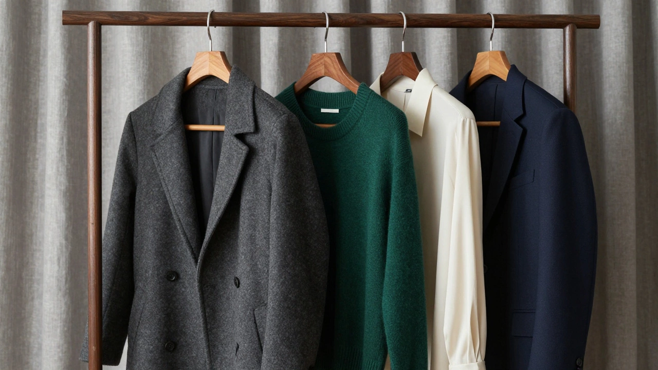
Rich-looking style isn’t about spending more. It’s about choosing less. Fewer colors. Better tones. More intention. A capsule wardrobe in navy, charcoal, deep green, cream, and black will outshine a closet full of bright, mismatched trends every time.
Start with one piece. Swap your light blue shirt for a navy one. Replace your beige pants with charcoal. Wear a deep burgundy sweater instead of a red one. Notice how people look at you differently. Not because you changed your brand. But because you changed your color.
Color is the quietest form of power
People don’t notice your clothes. They notice how you look in them. And that starts with color. It’s the first thing the eye picks up before the cut, the fabric, or the brand. A well-chosen color makes you look taller, sharper, calmer, and more in control.
There’s no magic formula. But there are patterns. Deep tones. Clean lines. Minimal contrast. No distractions. That’s the language of wealth. And it doesn’t cost a fortune to speak it.